

Day 1: Understand
Business goals, design challenge and constraints
User interviews
User insights
User persona
Possible end-to-end map
Design Challenge
The information should enhance the museum experience and not overwhelm visitors with data.
Design Constraints
The solution should be designed as a mobile app or mobile-optimized website.
User Interviews Highlights

JANE
"I like to form my own opinion about art, but it can be hard to do that when I don't really know anything about the artist, or what their intentions were in creating the work"

NICK
"Sometimes I'll do a quick Google search for a painting while on my phone while at the museum...but I usually find long articles that are super overwhelming"

LIZA
"I often wonder - what would the artist tell me about this piece if they had a minute to talk to me? How could would that be?"

ANNA
"I enjoy looking at art, but sometimes I feel like I'm missing out on the full experience by not knowing any background information or context"

CLAIRE
"I may do a little research before my visit, but I always find a work of art that catches my eye that I didn't read about beforehand"

DANA
"There are so many times I find myself saying 'how did the artist do that?!' - I would love to know more about their process and technique"
Users want to know:
Four pieces of data: artist's information, why the piece is essential, historical context, and medium
Users are drawn to human tragedy
Users prefer information that is organized, short, and essential
Users value information presented in group tours, but prefer to visit the museum by themselves
Users need time to reflect on the piece and form their own opinion on the art piece
UX Research Artifacts
Day 2: Sketch Solution
On the second day, I used several research methods to investigate possible solutions.
Lightning demos
Crazy 8s
3-Panel board
Lightning Demos Artifacts
I looked at solutions four competitors have produced to solve a similar problem before sketching a solution. Competitors: Google Art & Culture mobile-optimized web, Art Institute of Chicago mobile app, Musee d'Orsay Mobile app, and DailyArt mobile app.
Crazy 8s & 3-Panel Board
I made a series of quick sketches, spending about a minute per sketch to develop as many ideas as possible for the art information screen (Crazy 8s method). After, I sketched the screen before and after the critical screen to create a 3-panel board.
Day 3: Decide & Storyboard
I sketched a 12-panel storyboard that includes my solution sketch for two options. Each screen consists of the necessary UI elements needed to build a prototype. I only sketched the screens needed to complete the tasks during usability testing.
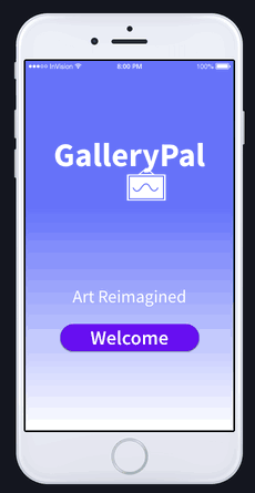
Day 4: Prototype
Using the sketches as guidance, I made high-fidelity screens with Sketch.

Analysis & Results
Users would prefer a pop-out in the Collection tab to remind them how to use the app GPS feature
Participants prefer to have a map shortcut in the Art screen
The links for Artist and Medium should be bigger, more visible
Participants prefer that the recommendations tag would function like a draw down menu
Add a "how it's made" button in the medium screen, and a video showing the art technique
Conclusion
I learned that people visiting museums prefer to get the information and move on to the next piece, other visitors prefer to admire the art and even sketch the work. The key is to give the necessary tools the users need and give them the independence to explore the museum.
When designing the GPS location feature, I was unsure if such technology was deployable since I didn't have time to research. At that time, it seemed like the best flow for users as it required fewer steps without having to enter any information manually. The use of GPS to locate an art piece is something I would like to investigate further with additional time.